18 One-Point Perspectives


18 Two-Point Perspectives


36 Custom Textures

Textures Used
 SCALAR
 LINEAR
 ROTATIONAL
Final Plan, Draft Plan
Drafts: 1, 2 (didn't end up using), 3 (elevator fraps)
Inspired Environment
Elevators in SketchUp

Although there may not be much detail, the 2 elevators ultimately portray what I intended. The student elevator takes a more curvaceous approach, whereas the Dean's elevator is far more rigid and boring (these polar opposites are the 2 most prominent features throughout my entire Exp 3, all stemming from my Mashup theory).
Folly in SketchUp

I decided that with the Folly I could make one final statement about Architectural Computing that stays true to my Theory, yet differs from the design matched to it. Software Design, and anything regarding computer science, is a very structured and formulaic process that requires precision and discipline. The joined identical F prisms is what I have used in order to incorporate this idea into my Experiment. To me they effectively represent the meticulously methodical nature of all software programs.
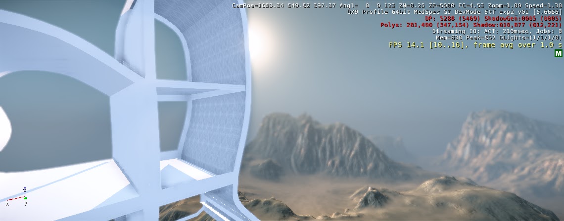
Real-Time Images

Entrance and Gallery: The highest mountain (situated in the left of the picture) is what holds up the walkway of the School. The entrance is probably the most obscure section of the structure, a suitable combination of Gehry's plan and my theory of Architectural Computing. It looks as if only a computer could construct such an object.

Main Entrance: As said above, the entrance and long walkway are probably the most versatile and grand in scale and aesthetics.

View from Student Elevator. The student elevator was designed to be simple, spacious and curvaceous. It gave a complete 360 degree view of the entire CryEngine environment (unlike the Dean's confined elevator), loosely representing the world of opportunities Software Engineering in Architecture can provide, as opposed to the constrained nature of a pencil and paper.
Student Spaces and Part of Gallery. The student spaces are large, open, airy, and are situated in spots with the best views and most sunlight. This layout was a product of my theory and accommodates (although selfish) well to it.

View from Student Elevator again.

Full School and Folly. I didn't end up including walls and windows to reinforce my theory of Paperless Architecture. Without paper, who needs windows? A breeze can't move a laptop.

Dean Elevator

Elevators in Motion. The two elevators are designed to move together, and end up in the same position on the walkway.
Two more full perspectives:


Unfortunately what ended up in SketchUp wasn't what should have been the final product. No matter what I tried it just didn't want to cross over properly and so I settled with what I've got. In the draft section on my submission you can see the real, detailed, version in SketchUp. The final product, however, does still reflect what was intended.
Song Credit: "So Long, Frank Lloyd Wright" by Simon & Garfunkel.
Paul Simon has always been my go-to artist when it comes to anything creative. So naturally, while completing Experiment 3 I was listening to A LOT of Simon & Garfunkel. Suddenly, a song I don't find myself listening to too much came on: So Long, Frank Lloyd Wright, and I couldn't believe how strongly it connected to my theory. This is why I decided to incorporate this song into the video I made of my CryEngine environment: it not only strengthens the argument of my theory (So Long, Older Architecture) but adds that extra element to the presentation of my School of Architecture.
LINK TO FILES


